The HyperFluent Movement: The Art Trend Redefining 2025

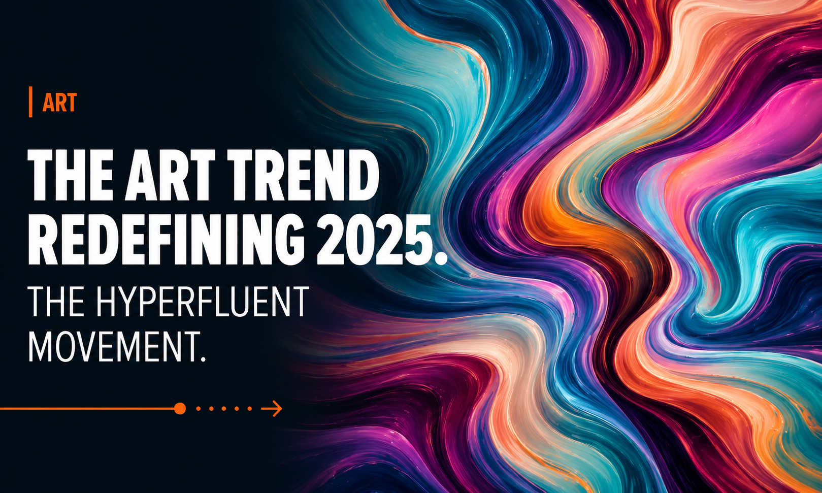
The art trend redefiniing in 2025. The Hyperfluent Movement.

A new wave of creativity is exploding across the art world — bold, fluid, unpredictable, and utterly mesmerizing. Welcome to The HyperFluent Movement, the latest art trend capturing the imagination of painters, digital artists, NFT creators, interior designers, and futurists alike.

HyperFluent art is all about motion, emotion, and transformation. It blends kinetic energy with surreal color patterns, creating living visuals that feel like they’re breathing on the canvas. Think of it as a fusion between liquid metal, neon dreams, and abstract consciousness.
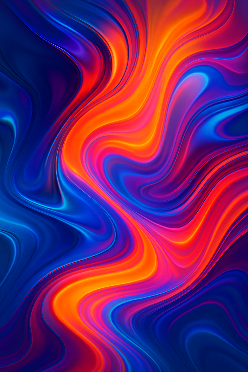
Hyperfluent Artwork
Hyperfluent Artwork

What Makes HyperFluent So Unique?

  • Fluid Dynamics as Art: Each piece feels like it’s in motion, even when completely still.
  • Chromatic Emotions: Artists use shifting color gradients to express raw feelings — from cosmic calm to electrified energy.
  • AI–Human Collaboration: Many creators blend traditional techniques with AI-powered morphing tools to achieve impossible textures.
  • Multi-Dimensional Design: HyperFluent works often mix 2D and 3D elements, creating art that feels like it’s leaping out of reality.

Why It’s Taking Over

As society moves deeper into the digital era, people crave art that reflects constant change. HyperFluent captures that restless transformation beautifully. It’s being featured in galleries, viral TikTok art videos, futuristic branding campaigns, and even VR spaces.

Interior designers are calling it the “aura art” of the decade because its glowing fluid forms instantly transform a room.

What You’ll See in a HyperFluent Piece

  • Metallic, liquid-like surfaces
  • Flowing ribbons of neon or iridescent color
  • Abstract shapes shifting in form
  • Movement implied through warped reflections
  • A dreamy, hypnotic sense of depth

This movement doesn’t just look mesmerizing — it feels alive.
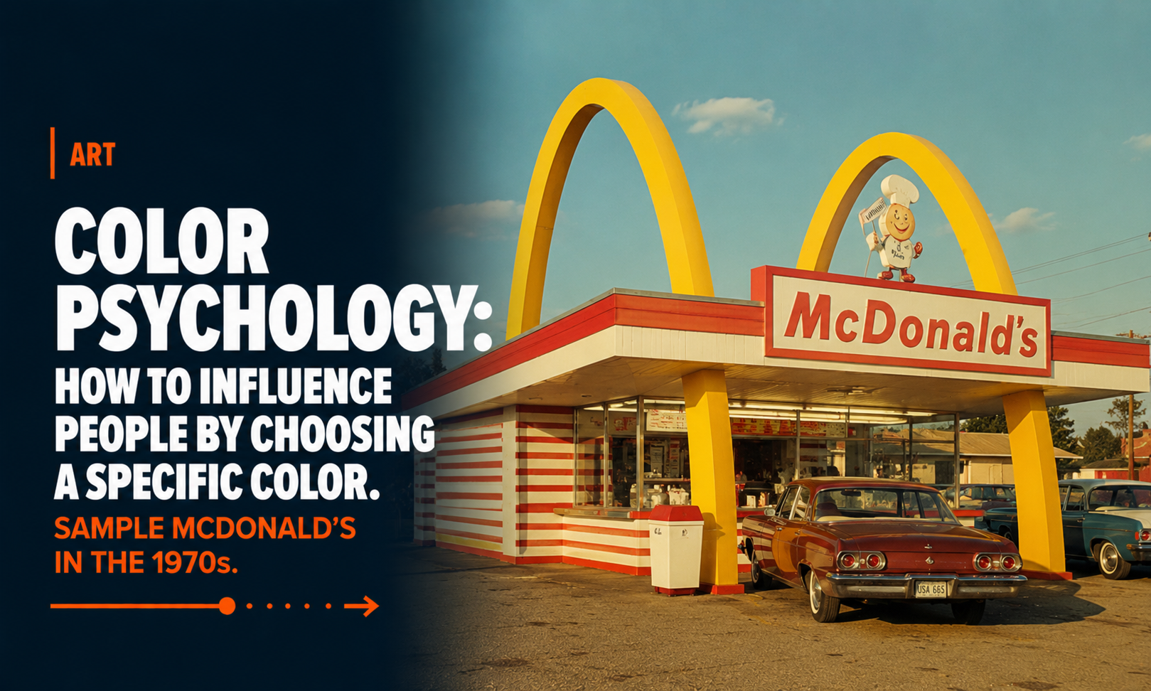
Color psychology: How to influence people by choosing a specific color.

Color psychology: How to influence people by choosing a specific color. Sample McDonald´s in the 1970s.

Did you know that back in the 1970s, McDonald’s deliberately used orange as one of its key interior colors? It wasn’t a random design choice — it was rooted in color psychology. Fast-food chains of that era were early adopters of the idea that colors could influence how people feel, behave, and even how hungry they become.

Orange was believed to be a warm, energetic, appetite-stimulating color. It created a sense of vibrancy and excitement, subtly encouraging guests to feel hungrier and more eager to eat. Paired with reds and yellows — colors that are still iconic in the McDonald’s brand — the overall effect was meant to make the dining environment feel lively, fast-paced, and inviting.

But there was another layer: these bright colors were not only used to spark appetite, they were also strategically chosen to encourage faster turnover. Bold, intense hues tend to make people eat quicker and leave sooner, which perfectly aligned with the fast-food model.

Over time, McDonald’s design philosophy evolved. The brand gradually shifted toward more neutral, calming interiors — grays, soft woods, muted greens — creating a more relaxed atmosphere as dining habits changed and the chain aimed for a more contemporary café-style feel.

Still, that 1970s orange era remains a fascinating example of how brands have long used psychology and design to shape the dining experience, proving that even the color on the walls can influence how we experience our food.

Sign on the road: this way! This way to McDonald´s
Sign on the road: this way!