The Sky opens up

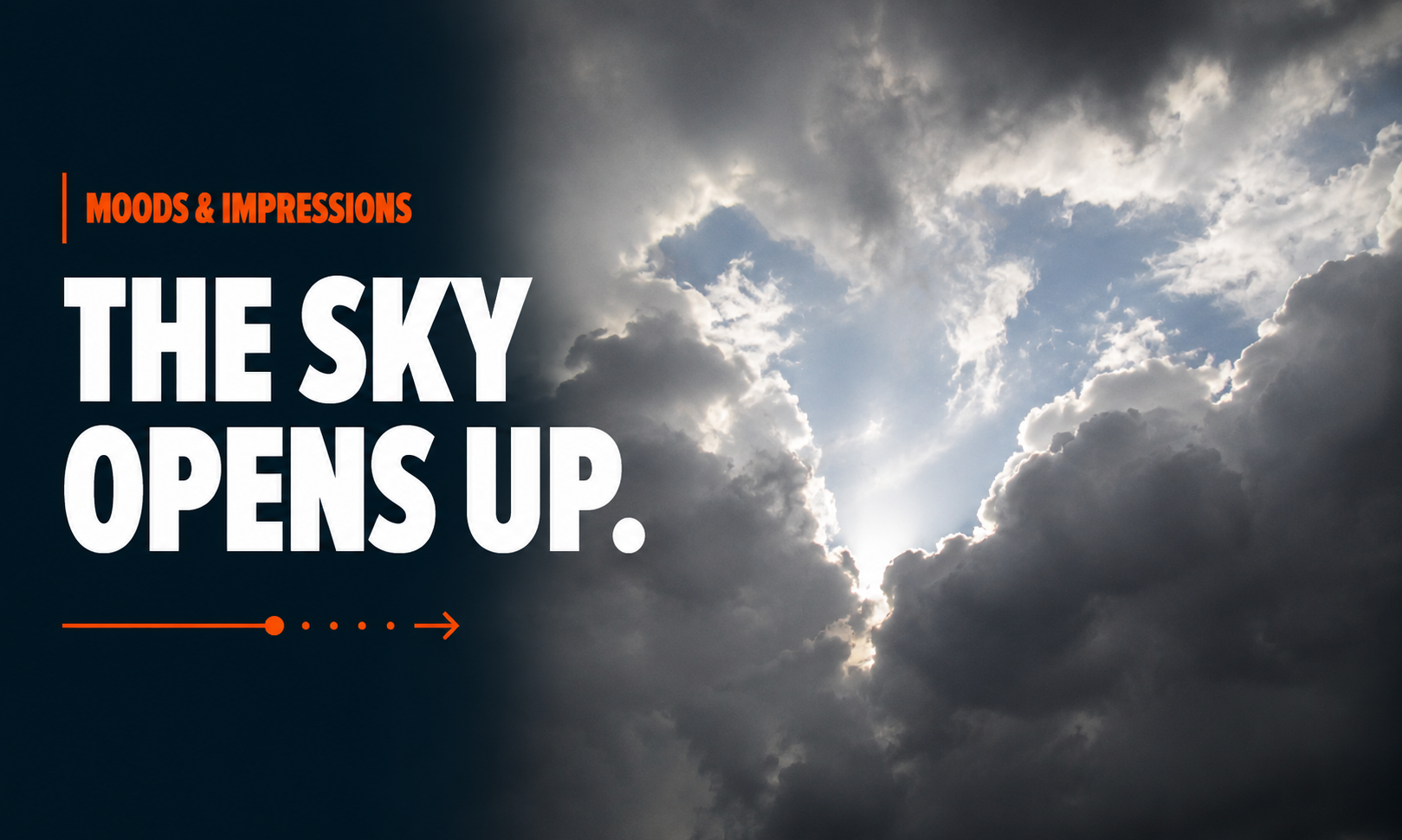
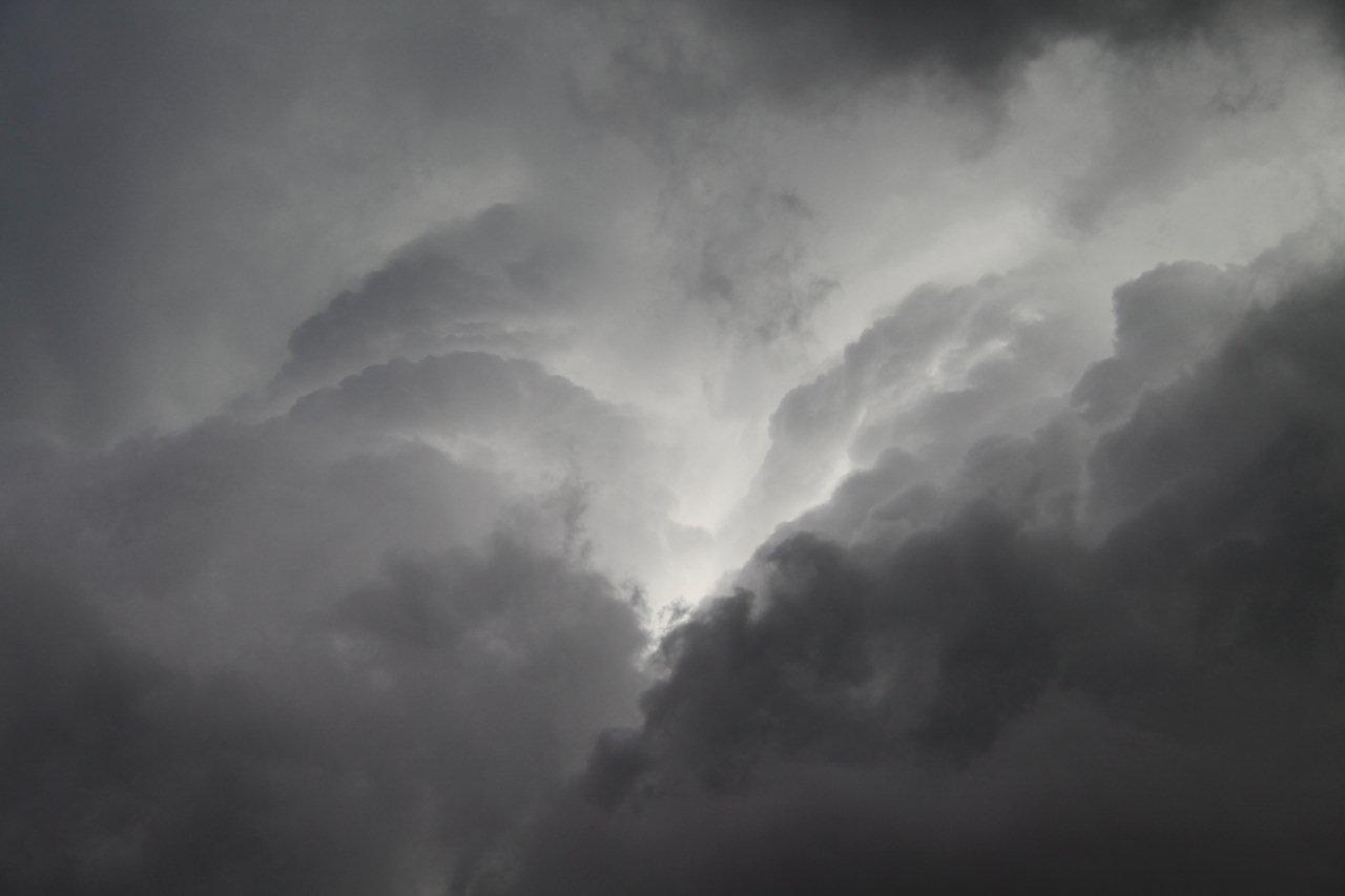
Mood picture of the sky that opens up after a storm.
The sky opens up
The sky opens up

What causes a weather phenomenon like this?

What you captured is most likely a moment of convective cloud separation — a dramatic atmospheric event where dense storm clouds temporarily split and reveal a break of intense light.

Meteorologically, several forces can create this:

1. Cumulonimbus Development (Storm Tower Dynamics)

These towering storm clouds are vertical engines.

Warm air rises rapidly.
Cold air sinks.

This creates massive internal turbulence.

At certain moments, the updraft weakens or shifts, causing a visible rupture in the cloud mass.

What you’re seeing:
a temporary “window” into higher atmospheric layers.

Think of it as the sky breathing.


2. Dry Air Intrusion

Sometimes dry air from higher altitudes pushes into moisture-heavy storm systems.

This literally erodes parts of the cloud.

Result:

  • sharp openings
  • dramatic light beams
  • high-contrast cloud architecture

This is often why the opening looks almost carved.


3. Sun Angle + Scattering Physics

The emotional impact comes from light.

When sunlight breaks through thick storm clouds, it creates:

crepuscular rays

Visible beams caused by particles scattering light.

That’s why it often feels divine or cinematic.

The brain interprets:

light = relief
darkness = tension

Nature is playing with contrast.


Why this fascinates us psychologically

This is where it gets interesting.

Humans are deeply wired to respond to:

  • contrast
  • emergence
  • revelation

A sky opening after darkness triggers primal associations:

  • hope after uncertainty
  • clarity after chaos
  • breakthrough after struggle

It’s atmospheric storytelling.

No wonder almost every religion uses this image.
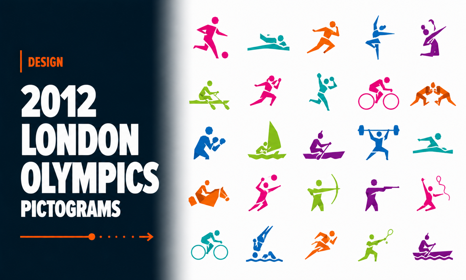
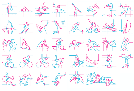
2012 London Olympics Pictograms

2012 London Olymics pictograms

The new olympics pictograms are out: http://www.designboom.com/weblog/cat/8/view/7907/2012-london-olympics-pictograms.html. I have to say that Otl Aicher’s (http://de.wikipedia.org/wiki/Otl_Aicher) pictograms were much more reduced and simplyfied. For me, this is a step back from ideal pictograms that can be read by all nations.

olympics pictograms
Olympic 2012 pictograms

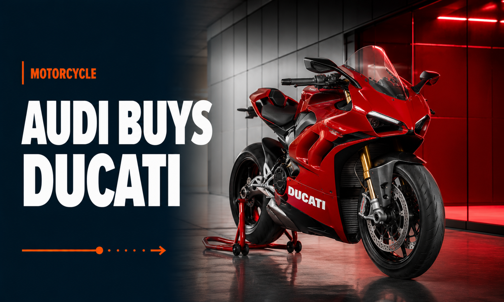
Audi buys Ducati

Audi buys Ducati

Great news. One can only guess what opportunities this deal will bring in the future. The Design of Ducati and the quality and technology of Audi. Watch out BMW, time to face a true European competitor. I look forward to the first Ducaudi…

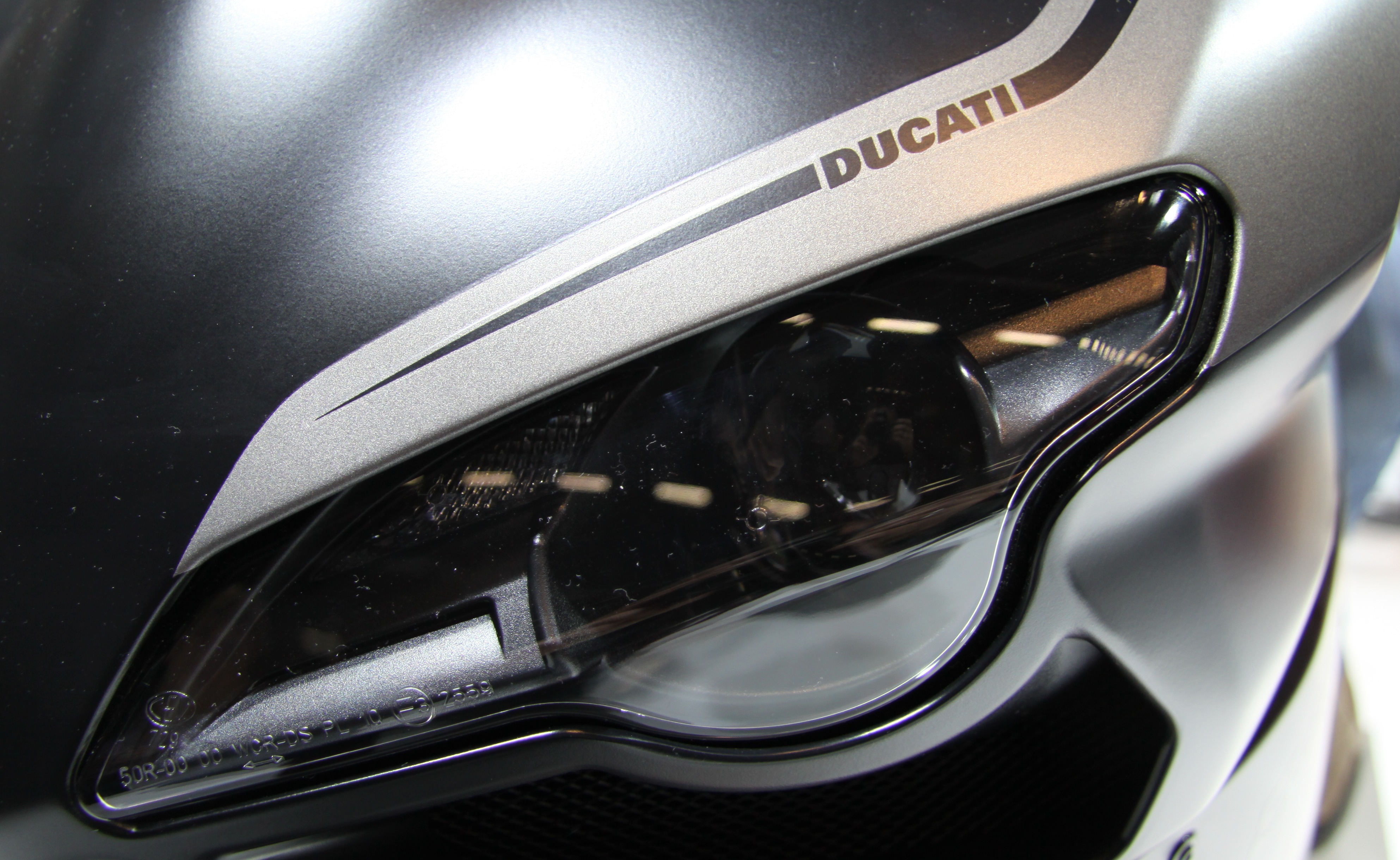
Front light Ducati
Front light Ducati

Color psychology: How to influence people by choosing a specific color.

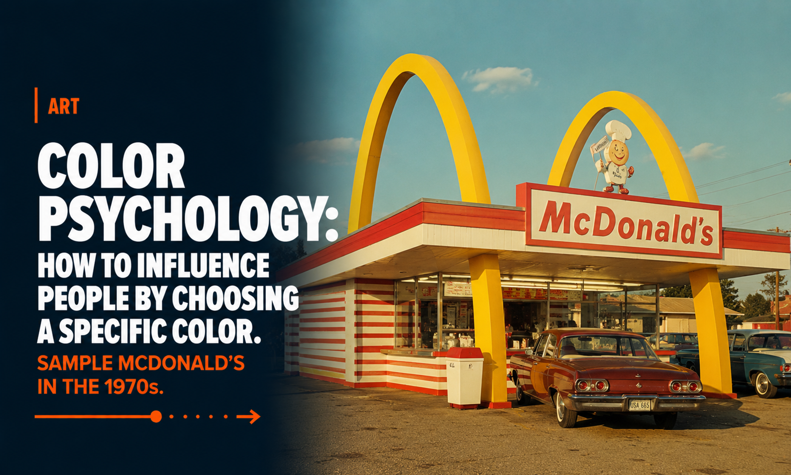
Color psychology: How to influence people by choosing a specific color. Sample McDonald´s in the 1970s.

Did you know that back in the 1970s, McDonald’s deliberately used orange as one of its key interior colors? It wasn’t a random design choice — it was rooted in color psychology. Fast-food chains of that era were early adopters of the idea that colors could influence how people feel, behave, and even how hungry they become.

Orange was believed to be a warm, energetic, appetite-stimulating color. It created a sense of vibrancy and excitement, subtly encouraging guests to feel hungrier and more eager to eat. Paired with reds and yellows — colors that are still iconic in the McDonald’s brand — the overall effect was meant to make the dining environment feel lively, fast-paced, and inviting.

But there was another layer: these bright colors were not only used to spark appetite, they were also strategically chosen to encourage faster turnover. Bold, intense hues tend to make people eat quicker and leave sooner, which perfectly aligned with the fast-food model.

Over time, McDonald’s design philosophy evolved. The brand gradually shifted toward more neutral, calming interiors — grays, soft woods, muted greens — creating a more relaxed atmosphere as dining habits changed and the chain aimed for a more contemporary café-style feel.

Still, that 1970s orange era remains a fascinating example of how brands have long used psychology and design to shape the dining experience, proving that even the color on the walls can influence how we experience our food.

Sign on the road: this way! This way to McDonald´s
Sign on the road: this way!